Looking at the sport activities that the sport watch collected, it is really telling something interesting story.
Inspired by Dr. G., I think I should tell more stories using the data rather than only pictures. Google Charts provide some very good examples. I was planning to embed that google chart code in my website. But I found that, actually I can used the current platform to achieve my goal. I used the markdown file as default. But it also support the R markdown, which is a more flexible file. In the R markdown file, I can plot using data.
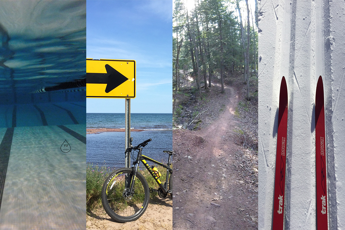
Learning by doing. The past two-year data collected from the watch is very interesting.
From the time series figure of 2017 to 2018, it includes swimming, cycling, running and others (walking and fitness). The swimming activity showed two peaks. One peak at May, and the other peak at October and November. For my understand, I swam a lot of times during May because the exciting feel of the new watch. The second peak was due to the transition time between cycling and winter sports. My cycling activity mainly occurred at summer time.
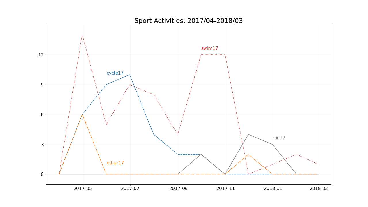
The python code for the time series plotting was displayed as the following:
|
|
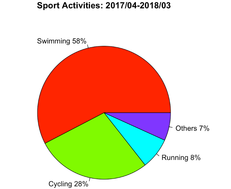
Then, the pie chart tells that swimming occupied 58% of the recorded activities from 2017/04 to 2018/03. Cycling has 28%.
For the second year (2018/04 to 2019/03), there is only one high peak for swimming that happened at July. That time was supposed to be a good time for cycling. But last year, the rains and flash flood made the cycling environment not so friendly. Another highlight was the XC skiing activity, I learned from February, 2019. But you can tell I skiied 10 times in 2 months, that's roughly 1 time per week.
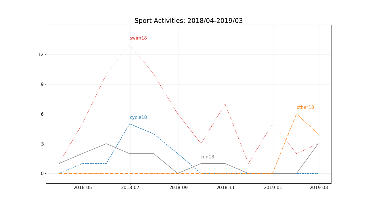
In terms of the pie chart, the swimming activity was still in a dominant position. It was in that position, and I think it will still be in that position. The new activity of XC skiing contributes to 10%. Considering the new activities just in two months, the potential can not be ignored.
